
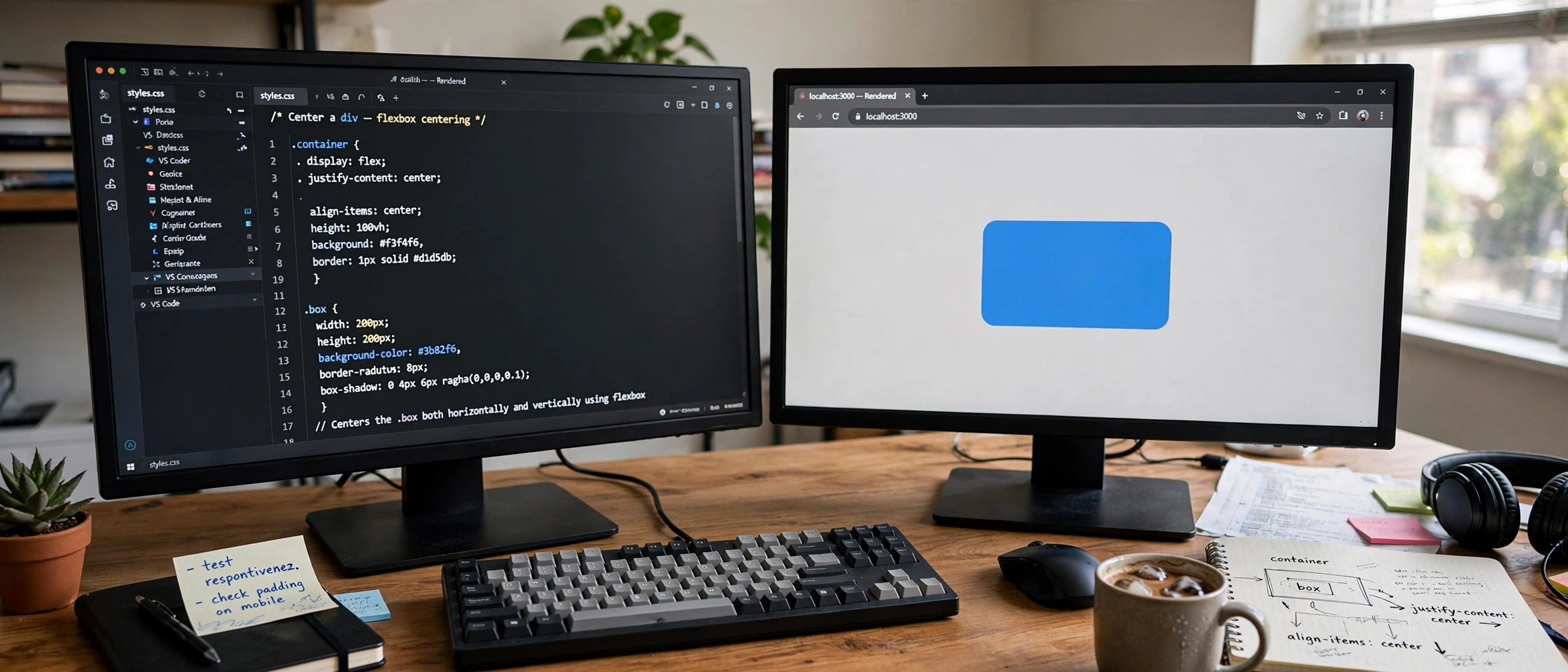
Learning how to center a div in CSS is a rite of passage for every web developer, and it is famously trickier than it sounds. The right method depends on what you are centering, whether it is horizontal, vertical, or both, and how old the browsers you support are. This guide explains all 7 reliable methods for how to center a div in CSS, with copy-paste code for each, a clear rule for when to use which, and the common mistakes that make centering silently fail.
In This Guide
- Why Centering a Div Is Trickier Than It Looks
- Method 1: Flexbox (The Modern Default)
- Method 2: CSS Grid (The One-Liner)
- Method 3: Margin Auto (Horizontal Centering)
- Method 4: Absolute Positioning + Transform
- Method 5: Text-Align for Inline Content
- Method 6: Line-Height for Single Lines
- Method 7: Table-Cell (The Legacy Fallback)
- Which Method Should You Use? Decision Guide
- 5 Mistakes That Break Centering
- Frequently Asked Questions
- Key Takeaways
Why Centering a Div Is Trickier Than It Looks
A div is a block-level element: by default it stretches to fill its parent’s full width and stacks vertically. Centering it means fighting those defaults in two independent axes. Horizontal centering is usually easy; vertical centering is where beginners suffer, because a parent’s height is often determined by its content, leaving nothing to center against.
The key insight: most centering methods require you to define the space you are centering within. A flex container with no height cannot vertically center anything, because there is no extra space to distribute. Once you internalize that, every method below becomes obvious. If you are still learning layout fundamentals, our comparison of CSS Flexbox vs Grid and when to use each will give you the bigger picture these techniques fit into.
Method 1: Flexbox (The Modern Default)

Flexbox is the answer most of the time when you need to know how to center a div in CSS. Make the parent a flex container and center along both axes:
.parent {
  display: flex;
  justify-content: center; /* horizontal */
  align-items: center;     /* vertical */
  min-height: 100vh;       /* give it space to center within */
}
To center only horizontally, use justify-content: center alone; for only vertical, align-items: center alone. Flexbox also handles multiple children gracefully, spacing and wrapping them with gap, flex-wrap, and friends. Browser support is universal in every browser released in the last decade. The MDN guide to flexbox concepts is the authoritative reference if you want to go deeper.
When to Use Flexbox
Use it for centering anything inside a container: modals, hero sections, cards in a row, navigation bars. It is the best default choice and the one you should reach for first.
Method 2: CSS Grid (The One-Liner)
Grid centers with even less code. The place-items shorthand sets both alignment axes at once:
.parent {
  display: grid;
  place-items: center;
  min-height: 100vh;
}
That is genuinely the whole technique. Grid shines when the parent is already a grid layout, for example a page shell with header, content, and footer areas, where you want one cell’s content centered. Like flexbox, support is universal in modern browsers; see the MDN CSS grid layout guide for the full model.
When to Use Grid
Use it when the parent is a grid anyway, or when you want the absolute shortest centering code. For pure one-dimensional centering inside a simple container, flexbox and grid are interchangeable, so pick whichever matches the surrounding layout.
Method 3: Margin Auto (Horizontal Centering)
The classic technique for centering a block horizontally: give the div a width narrower than its parent, then let auto margins absorb the leftover space equally on both sides:
.child {
  width: 600px;        /* or max-width: 600px for responsiveness */
  margin: 0 auto;      /* top/bottom 0, left/right auto */
}
This works because a block box with a fixed width and margin-left: auto; margin-right: auto splits the remaining horizontal space evenly. It does nothing vertically, auto vertical margins compute to zero, which is the single most common misunderstanding about this method.
When to Use Margin Auto
Use it for the classic centered page column: a content wrapper with max-width centered in the viewport. It is simple, bulletproof, and needs no changes to the parent. Pair it with padding on the parent so content never touches screen edges on mobile.
Method 4: Absolute Positioning + Transform
When you need pixel-perfect centering of an element regardless of its size, such as a modal dialog or a tooltip, absolute positioning with a transform is the precision tool:
.parent {
  position: relative;
}
.child {
  position: absolute;
  top: 50%;
  left: 50%;
  transform: translate(-50%, -50%);
}
top: 50%; left: 50% places the child’s top-left corner at the parent’s center; translate(-50%, -50%) then shifts the child back by half of its own width and height. Because the percentages in translate refer to the element itself, this works for any child size without knowing it in advance.
When to Use Absolute + Transform
Use it for overlays, modals, badges pinned to a corner-ish position, and any element removed from document flow. Avoid it for general page layout, since absolutely positioned elements do not affect their parent’s height and can overlap content on small screens.
Method 5: Text-Align for Inline Content
If what you are centering is text, images, or inline-block elements rather than a block div, the simplest tool is text-align: center on the parent:
.parent {
  text-align: center;
}
.parent img {
  display: inline-block; /* images center as inline content */
}
This centers inline-level content within each line box. It is perfect for headings, paragraphs, and button rows. It will not center a block-level div itself, a mistake beginners make constantly: text-align aligns a box’s inline contents, not the box.
Method 6: Line-Height for Single Lines
For vertically centering a single line of text inside a fixed-height container, matching line-height to the height is the oldest trick in the book:
.button {
  height: 48px;
  line-height: 48px;
  text-align: center;
}
The text sits on a 48px-tall line box inside a 48px-tall container, so it lands vertically centered. This breaks the moment text wraps to two lines, so restrict it to buttons, badges, and nav items where wrapping cannot happen. For multi-line vertical centering, go back to flexbox.
Method 7: Table-Cell (The Legacy Fallback)
Before flexbox existed, vertical centering meant faking a table. It still works everywhere, including ancient browsers:
.parent {
  display: table-cell;
  vertical-align: middle;
  text-align: center;
  width: 100vw;
  height: 100vh;
}
You will rarely need this in 2026, but it is worth knowing when you inherit a codebase that must support truly old rendering engines, or when flexbox is disabled by some constraint. For everything else, prefer methods 1 and 2.
Which Method Should You Use? Decision Guide
| Situation | Best Method |
|---|---|
| Center anything both ways (default choice) | Flexbox or Grid |
| Centered page column / article wrapper | Margin auto with max-width |
| Modal, tooltip, overlay | Absolute + translate(-50%, -50%) |
| Center text or inline images | text-align: center |
| Single-line button text | line-height equals height |
| Must support very old browsers | Table-cell |
Notice the pattern: flexbox and grid handle the general case, and the other methods are specialists. Learn the general case first, then add the specialists to your toolbox. Responsive behavior matters too; once your layout centers nicely, make sure it adapts to small screens with our guide on making a website responsive with CSS media queries.
5 Mistakes That Break Centering
1. No Height on the Parent
align-items: center with no parent height centers within zero extra space, which looks like nothing happened. Set min-height (e.g. 100vh for full-viewport heroes).
2. Margin Auto Without a Width
A block div defaults to full width, leaving no leftover space for auto margins to distribute. Always set width or max-width on the child.
3. text-align on the Wrong Element
text-align: center goes on the parent and centers inline content; it never centers the block box itself.
4. Forgetting position: relative on the Parent
An absolutely positioned child anchors to the nearest positioned ancestor. Without position: relative on the parent, your “centered” modal centers against the whole page instead.
5. Mixing Methods That Fight Each Other
Combining margin: auto with flexbox centering, or absolute positioning inside a flex container without intent, produces unpredictable results. Pick one method per axis and commit.
Frequently Asked Questions
How do I center a div horizontally and vertically at the same time?
Use flexbox: display: flex; justify-content: center; align-items: center; on the parent, with a min-height set. Or grid: display: grid; place-items: center;.
Why is margin: 0 auto not working?
Almost always because the div has no width set (it defaults to 100%, leaving no space to distribute), or because you need vertical centering, which margin auto cannot do.
How do I center a div inside another div?
Make the outer div a flex or grid container with centering properties. The inner div needs no special styles at all.
Does text-align: center work on a div?
It centers the div’s inline contents (text, images), not the div itself. To center the div box, use margin auto with a width, or center it from the parent with flexbox.
How do I center a div without flexbox?
Use margin: 0 auto with a set width for horizontal centering, absolute positioning with transform: translate(-50%, -50%) for both axes, or the table-cell technique for legacy browsers.
Which centering method is best for responsive design?
Flexbox and grid, because they adapt to content size and viewport changes without fixed pixel values. Combine max-width with margin auto for centered columns that shrink gracefully on mobile.
Key Takeaways
- Flexbox (
justify-content+align-items) and grid (place-items: center) are the modern defaults for centering a div. margin: 0 autowith a set width is the classic way to center a block horizontally, like a page column.- Absolute positioning with
translate(-50%, -50%)gives pixel-perfect centering for modals and overlays. text-align: centercenters inline content, never the block box itself.- Vertical centering needs the parent to have height; without it, there is no space to center within.
- Match the method to the situation using the decision table, and avoid mixing competing techniques.
Conclusion
Mastering how to center a div in CSS comes down to one mental model: define the space, then pick the tool. Flexbox and grid handle nearly every real layout, margin auto owns the centered-column pattern, absolute positioning with transform owns overlays, and the small specialists cover text and single lines. The next time centering “doesn’t work,” run through the five mistakes above before rewriting anything; the fix is usually a missing height or width, not a broken method. Keep practicing with real layouts, and check our guide to HTML semantic tags to make sure the divs you are centering sit inside clean, meaningful markup.