
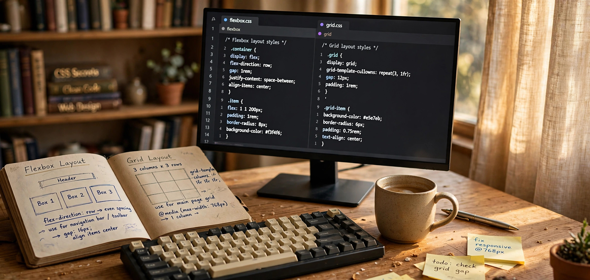
Choosing between CSS flexbox vs grid — when to use each — is one of the most common layout questions front-end developers face. Both are powerful native CSS layout systems, and both shipped with excellent browser support years ago, so the debate is no longer about compatibility. It is about intent: flexbox is designed for one-dimensional layouts (a row or a column), while grid is designed for two-dimensional layouts (rows and columns together). In this guide, you will learn exactly how to tell them apart, when to reach for each one, and — just as important — when to combine them on the same page.
In This Guide
- The Core Difference Between Flexbox and Grid
- When to Use Flexbox: 5 Real Scenarios
- When to Use CSS Grid: 5 Real Scenarios
- Flexbox vs Grid: Side-by-Side Code Comparison
- Combining Flexbox and Grid on the Same Page
- Common Mistakes to Avoid
- Frequently Asked Questions
- Key Takeaways
- Conclusion: CSS Flexbox vs Grid When to Use Each
The Core Difference Between Flexbox and Grid
Flexbox (the display: flex model) lays items out along a single axis — either horizontal (row) or vertical (column). You get fine-grained control over how items grow, shrink, align, and wrap along that axis, but flexbox does not naturally think in terms of a two-dimensional grid of rows and columns.
CSS Grid (the display: grid model) lays items out along two axes at once. You define a grid of rows and columns, and you can place items precisely into that structure — including spanning an item across multiple rows or columns.
A useful mental model: flexbox works from the content outward (items size themselves and the layout reacts), while grid works from the layout inward (you define the structure first and place content into it). Neither is better in absolute terms; they solve different problems.
The one-question test
Ask yourself one question about the component you are building: do I need to control both rows and columns?
- If the answer is no — a row of buttons, a vertical stack of cards, a centered hero — use flexbox.
- If the answer is yes — a photo gallery, a dashboard, a 12-column page layout — use grid.
When to Use Flexbox: 5 Real Scenarios

1. Navigation bars
A navbar is a classic one-dimensional problem: a row of links, possibly with a logo on the left and a button on the right. Flexbox with justify-content: space-between solves it in three lines:
.navbar {
  display: flex;
  align-items: center;
  justify-content: space-between;
  padding: 1rem 2rem;
}
2. Centering anything (the “holy grail” of CSS)
Flexbox made centering trivial, both horizontally and vertically:
.hero {
  display: flex;
  align-items: center;
  justify-content: center;
  min-height: 80vh;
}
For a full rundown of every centering technique, see how to center a div with CSS (all methods explained).
3. Button groups, tags, and chips
Rows of items that should wrap gracefully and keep even gaps are flexbox territory. The gap property (supported in flexbox since 2021 in all major browsers) removes the old margin hacks:
.tag-list {
  display: flex;
  flex-wrap: wrap;
  gap: 0.5rem;
}
4. Form rows and input groups
Label-plus-input pairs, search bars with a button attached, and multi-column form rows are one-dimensional flows. Flexbox lets the input grow while the button keeps its size:
.search-bar {
  display: flex;
  gap: 0.5rem;
}

.search-bar input {
  flex: 1;          /* input takes all leftover space */
}

.search-bar button {
  flex: none;       /* button keeps its natural width */
}
5. Card components with “sticky” footers
When cards in a row must have their footers aligned at the bottom regardless of content length, flexbox column layout with margin-top: auto does it:
.card {
  display: flex;
  flex-direction: column;
}

.card .card-footer {
  margin-top: auto; /* pushes footer to the bottom */
}
When to Use CSS Grid: 5 Real Scenarios
1. Full page layouts
Header, sidebar, main content, footer — a two-dimensional structure. Grid’s template areas read like a blueprint of the page:
.page {
  display: grid;
  grid-template-columns: 240px 1fr;
  grid-template-rows: auto 1fr auto;
  grid-template-areas:
    "header header"
    "sidebar main"
    "footer footer";
  min-height: 100vh;
}

.page-header  { grid-area: header; }
.page-sidebar { grid-area: sidebar; }
.page-main    { grid-area: main; }
.page-footer  { grid-area: footer; }
2. Responsive card galleries with no media queries
The famous auto-fit + minmax() pattern creates a responsive grid that adds or removes columns automatically:
.gallery {
  display: grid;
  grid-template-columns: repeat(auto-fit, minmax(260px, 1fr));
  gap: 1.5rem;
}
This is often the cleanest answer to responsive design without breakpoints. For the breakpoint-based approach, read how to make a website responsive with CSS media queries.
3. Dashboards and bento-style layouts
When some widgets must span two columns and others span two rows, only grid gives you that control directly:
.dashboard {
  display: grid;
  grid-template-columns: repeat(4, 1fr);
  grid-auto-rows: 160px;
  gap: 1rem;
}

.widget-wide {
  grid-column: span 2;
}

.widget-tall {
  grid-row: span 2;
}
4. Overlapping elements
Layering an image behind text, or a badge over a product photo, is easy when items can share the same grid cell:
.hero-banner {
  display: grid;
}

.hero-banner > * {
  grid-column: 1 / -1;
  grid-row: 1 / -1;
}

.hero-banner .caption {
  align-self: end;
  padding: 2rem;
  background: linear-gradient(transparent, rgba(0, 0, 0, 0.7));
  color: #fff;
}
5. Explicit forms with label/input alignment
A settings form with aligned labels in column one and inputs in column two is a two-dimensional problem and reads naturally as a grid:
.settings-form {
  display: grid;
  grid-template-columns: 160px 1fr;
  gap: 0.75rem 1.5rem;
  align-items: center;
}
Flexbox vs Grid: Side-by-Side Code Comparison
The same three-column card row shows how the two models differ in approach. With flexbox, you size the items:
/* Flexbox: items define the layout */
.card-row {
  display: flex;
  flex-wrap: wrap;
  gap: 1.5rem;
}

.card-row .card {
  flex: 1 1 280px; /* grow, shrink, base width */
}
With grid, you define the track structure and the items fall in:
/* Grid: the container defines the layout */
.card-row {
  display: grid;
  grid-template-columns: repeat(3, 1fr);
  gap: 1.5rem;
}
Notice the trade-off: the flexbox version wraps to new rows automatically when space runs out, while the grid version keeps exactly three columns until you add a media query (or switch to the auto-fit pattern from the previous section).
Quick reference table
If you need a cheat sheet to pin to your wall:
- Layout direction: flexbox = one axis; grid = two axes.
- Alignment: both support
align-items,justify-content, andgap. - Wrapping: flexbox wraps with
flex-wrap; grid creates tracks withauto-fit/auto-fill. - Item placement: flexbox orders items; grid can place any item in any cell.
- Browser support: both are universally supported in all modern browsers — no prefixes needed in 2026.
Combining Flexbox and Grid on the Same Page
In real projects you almost never pick just one. The standard professional pattern is: grid for the macro layout, flexbox for the micro layout. The page skeleton (header, sidebar, main, footer) is a grid; each navbar, button group, and card inside it is flexbox.
<div class="page">
  <header class="page-header">
    <nav class="navbar">...</nav>      <!-- flexbox inside -->
  </header>
  <aside class="page-sidebar">
    <ul class="menu">...</ul>          <!-- flexbox column -->
  </aside>
  <main class="page-main">
    <section class="gallery">...</section> <!-- nested grid -->
  </main>
  <footer class="page-footer">...</footer>
</div>
A grid item can itself be a flex container, and a flex item can be a grid container. They compose freely — there is no rule against nesting them, and doing so is considered best practice. The MDN documentation confirms both models are designed to work together: see MDN’s guide to grid’s relationship with other layout methods and the flexbox basic concepts reference.
Common Mistakes to Avoid
Using flexbox for a true 2D layout
Trying to build a dashboard with nested flex rows gets fragile fast: column widths drift, spanning is impossible, and alignment across rows breaks. If you are fighting flex-basis percentages and negative margins, you probably need grid.
Using grid for a simple row of items
A row of three buttons does not need grid-template-columns: repeat(3, auto). Flexbox is shorter, clearer, and wraps for free.
Forgetting that grid items are blockified
Children of a grid container become grid items and lose their float and inline behavior. If a grid child needs its own internal layout, make it a flex container explicitly.
Over-specifying with both
Setting display: grid on an element and then also fighting it with float or inline-block children creates unpredictable results. Pick one layout model per container and commit to it.
Ignoring the gap property
Both flexbox and grid support gap, row-gap, and column-gap. If your layout code is full of :last-child { margin-right: 0 } hacks, replace them with gap today.
Frequently Asked Questions
Is CSS Grid better than Flexbox?
Neither is better overall. Grid is better for two-dimensional layouts (dashboards, galleries, page skeletons) and flexbox is better for one-dimensional flows (navbars, button rows, centering). Most production sites use both: grid for page structure, flexbox for components.
Can I use Flexbox and Grid together?
Yes — this is the recommended approach. A common pattern is a grid page layout where each section’s internal components (navbars, cards, form rows) use flexbox. A grid item can be a flex container and vice versa.
When should I use CSS Grid instead of Flexbox?
Use grid when you need to control both rows and columns: explicit page layouts, card galleries, dashboards with spanning widgets, and overlapping elements. If you catch yourself calculating percentage widths in flexbox, switch to grid.
Does Flexbox work in all browsers in 2026?
Yes. Flexbox and CSS Grid are both supported in all current versions of Chrome, Firefox, Safari, and Edge with no vendor prefixes required. The gap property in flexbox is supported everywhere since 2021.
Which is easier to learn first?
Flexbox has fewer concepts (main axis, cross axis, grow/shrink) and solves everyday problems like centering, so most developers learn it first. Grid’s track, line, and area concepts take a little longer, but the template-areas syntax is very readable once you try it. Learn flexbox first, then grid.
Should I still use media queries with Grid?
Sometimes. Patterns like repeat(auto-fit, minmax(260px, 1fr)) handle many responsive cases without breakpoints, but explicit layout changes (collapsing a sidebar into a top bar, for example) still need media queries. See how to make a website responsive with CSS media queries for the full technique.
Key Takeaways
- Flexbox is one-dimensional (row or column); CSS Grid is two-dimensional (rows and columns).
- Use flexbox for navbars, centering, button groups, form rows, and card footers.
- Use grid for page layouts, galleries, dashboards, overlapping elements, and aligned forms.
- The one-question test: if you need to control both rows and columns, reach for grid.
- Best practice is combining them — grid for the page skeleton, flexbox for the components inside.
- Both are universally supported in 2026 with no prefixes;
gapworks in both.
Conclusion: CSS Flexbox vs Grid When to Use Each
The css flexbox vs grid when to use question has a simple answer once you think in dimensions: one dimension means flexbox, two dimensions means grid, and real pages almost always use both. Start with flexbox for components — it is faster to write and easier to reason about — and reach for grid the moment you need explicit rows and columns, spanning, or overlap. Master this distinction and you will spend far less time fighting your layouts. For a hands-on follow-up, try adding a dark mode toggle to your finished layout with our JavaScript dark mode toggle guide.